PsyOn – Online Psychiatry Service Landing Page
A modern and clean landing page designed to simplify online psychiatric consultation booking and promote accessible mental health services.


PsyOn – Online Psychiatry Service
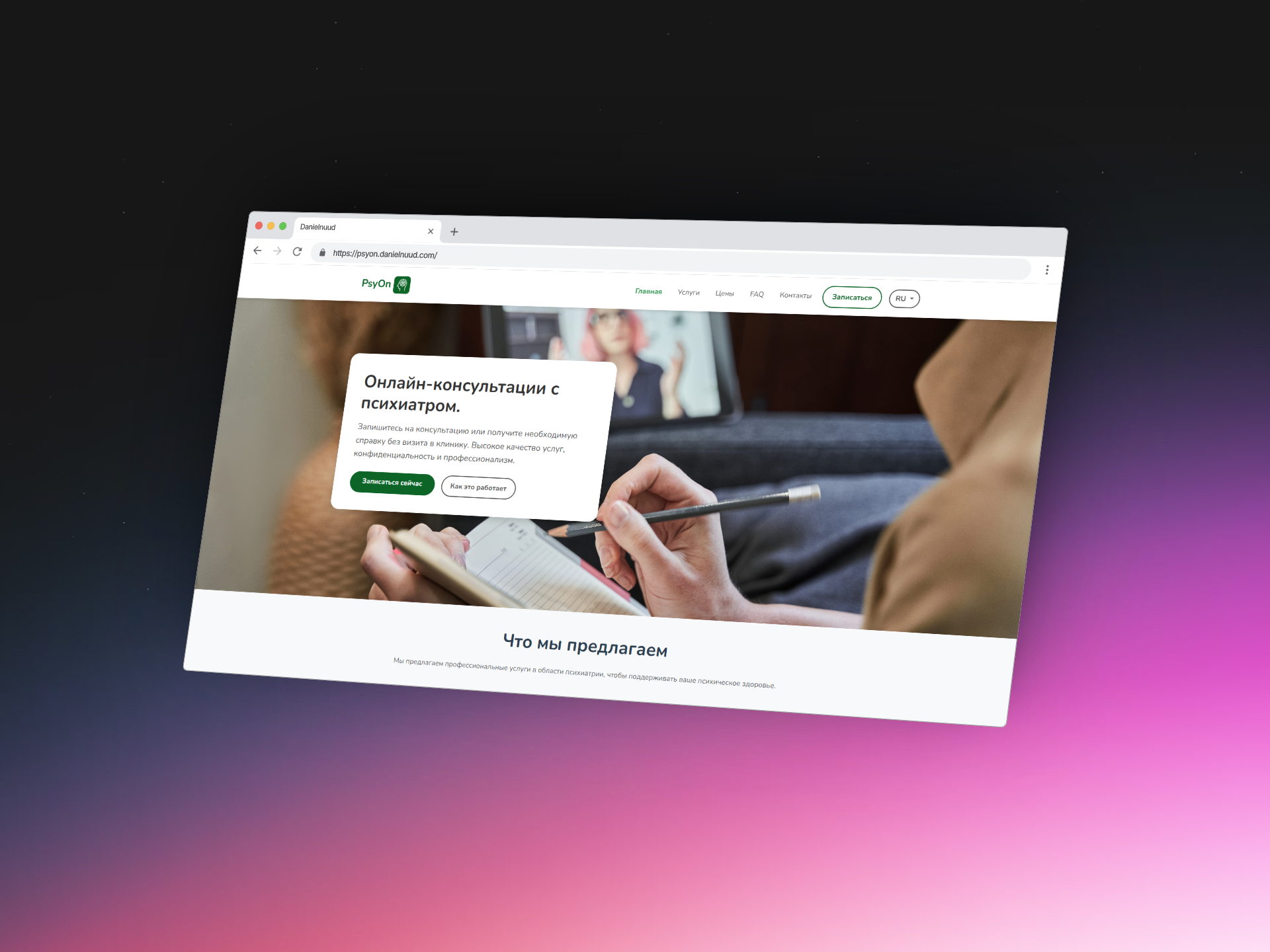
PsyOn is a landing page prototype for an online psychiatry service that offers remote consultations, digital certificate issuance, and easy scheduling. The goal was to create a professional yet approachable design that communicates trust and accessibility to users.
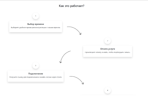
The structure includes a homepage with service overviews, available doctors, explanation of the consultation process, and direct booking options. The layout emphasizes clean UI, clarity of information, and mobile responsiveness.
This project was independently designed and implemented as a static responsive page using HTML, CSS, and Bootstrap. The goal was to translate a service-based concept into a clear, attractive digital presentation.
While the platform itself is fictional, the design was created with real-world usability in mind and can be further developed into a working solution.
This project was the final exam work for the university course in Web Design. It followed a complete UX/UI process – from creating personas, value proposition canvases, and usage scenarios (mobile & desktop), to developing low- and high-fidelity prototypes. The final design was accessibility-tested and refined before being implemented using HTML, CSS, and Bootstrap.
Project information
- CategoryWebsite
- Tools
- Project date 04 May, 2023
- Project URL https://psyon.danielnuud.com/
- Visit Website
Design Process
A comprehensive UX approach from research to prototyping
Understanding Barriers to Mental Healthcare Access
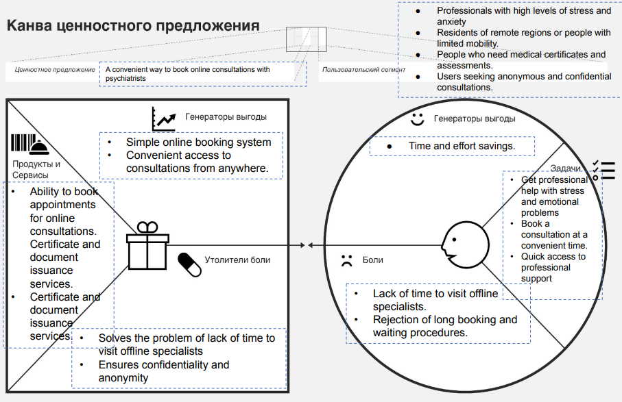
Conducted comprehensive research to identify pain points in accessing psychiatric services. Created value proposition canvas to map user needs against service benefits, and developed detailed personas to guide design decisions.
- → Created value proposition canvas (pains, gains, products/services)
- → Identified key user barriers: time constraints, stigma, accessibility
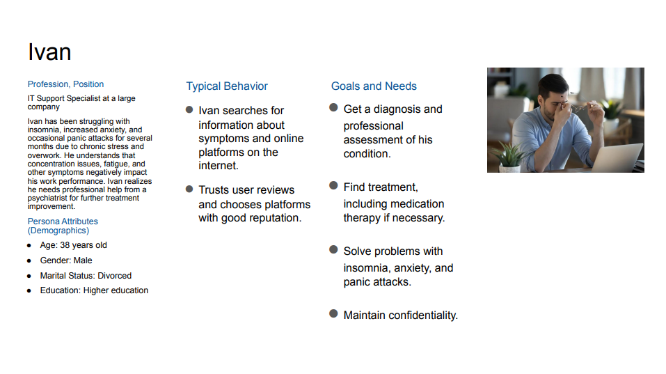
- → Developed user personas (Ivan - IT professional with anxiety)
- → Mapped user goals: professional diagnosis, confidentiality, convenience
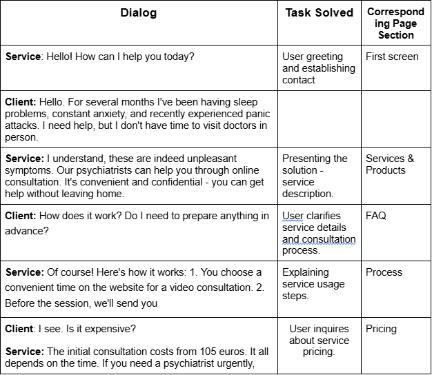
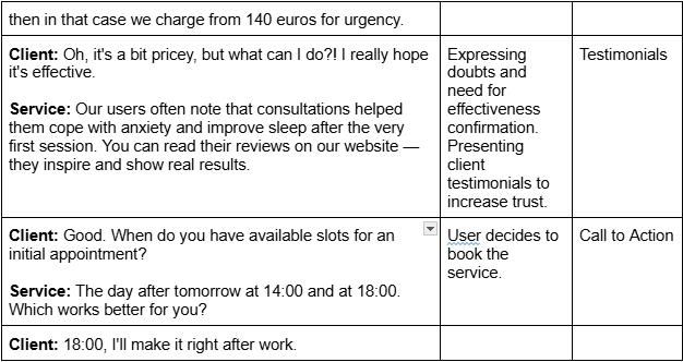
- → Defined service scenarios through dialog mapping
Defining User Scenarios and Service Touchpoints
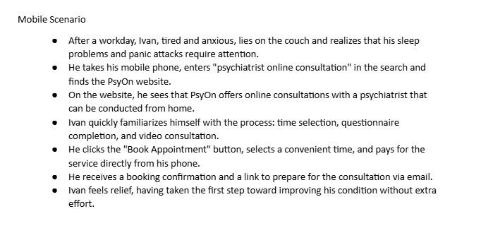
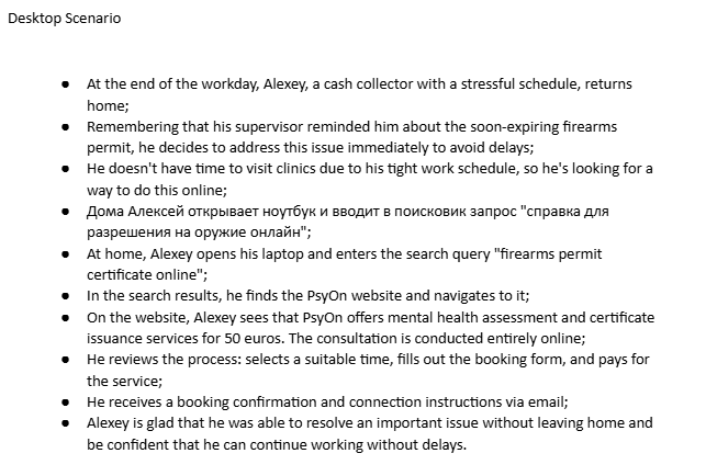
Created detailed scenarios for different user contexts (desktop and mobile) to map the complete user journey from problem awareness to successful booking. These scenarios helped identify key service touchpoints and ensure seamless experience across devices.
- → Developed scenarios for desktop and mobile users
- → Mapped journey from problem awareness to booking
- → Identified key touchpoints: search, comparison, trust, booking
- → Validated experience across different devices and contexts
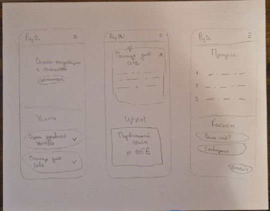
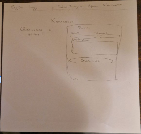
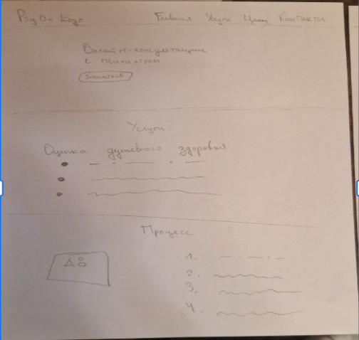
Low-Fidelity Prototyping
Started with rapid paper sketching to explore different layout options and navigation structures. This low-fidelity approach allowed quick iteration on key page elements without investing time in digital tools. Focused on main page structure, hero sections, service cards, and mobile navigation patterns.
- → Created paper sketches for homepage, services, and mobile views
- → Explored different hero section layouts and CTAs
- → Tested various content card arrangements
- → Defined responsive breakpoints for mobile-first design
- → Validated information architecture before digital wireframing
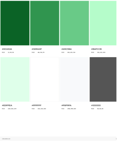
Creating a Trustworthy and Calming Visual Identity
Developed a visual design system rooted in psychology and trust-building. Selected green as the primary color to symbolize nature, health, and calmness—essential for a psychiatric service. Chose Nunito typeface for its friendly, approachable feel while maintaining professionalism and excellent readability across all devices.
- → Primary color: Green (#0C6427) - evokes trust, calmness, and health
- → Supporting palette: Light greens, grays for hierarchy and balance
- → Typography: Nunito - modern, friendly, highly readable
- → Designed to convey: trust, friendliness, professionalism, accuracy
- → Ensured WCAG accessibility standards for color contrast
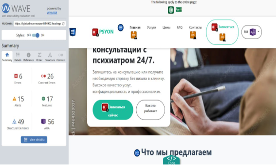
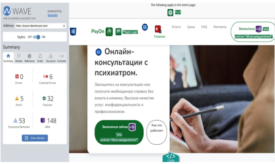
Bootstrap Implementation and Accessibility Testing
Implemented the design using Bootstrap framework to ensure responsive, mobile-first development. Conducted comprehensive accessibility testing with WAVE tool to meet WCAG standards. Identified and resolved issues with color contrast, semantic HTML structure, and form labels to ensure the platform is usable for people with disabilities.
- → Built responsive website using Bootstrap framework
- → Tested accessibility with WAVE evaluation tool
- → Fixed color contrast issues (darker green for better readability)
- → Added semantic HTML tags (header, main) for screen readers
- → Implemented proper heading hierarchy (h1→h2→h3)
- → Added form labels and ARIA attributes for accessibility